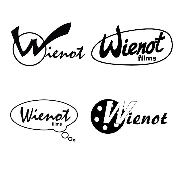
I have been agonizing over this logo idea for quite some time. We are trying to create a logo that gives the feel of what the company represents. The three words that are included sometimes with the logo or the mantra of the company are Passion, Story, and Dreams. The company produces a lot of hand drawn whiteboard explanatory videos along with live action video productions. It has been the most amazing experience working with Wienot Films.
On a tight budget we are looking for some of your responses to the logo and what you like or dislike about any of them? Which one do you respond to the most and why?
On a tight budget we are looking for some of your responses to the logo and what you like or dislike about any of them? Which one do you respond to the most and why?

3 comments:
I'm partial to the 2nd one.
I like the top right one. As for suggestion, maybe a different font, something like roboto (it's the free don't from android) thick for Wienot with the W being the largest, and real thin for films. Or you could go retro looking and use the font Market Deco which would give it the 50's style, kind of what you have going on with the funky shaped oval.
I like the 4th one!
Post a Comment